
Take your hue cues from Mother Nature and build decorating
themes and color schemes that are sure to please through every season.
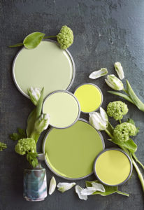
Go
garden fresh.
Inspired by trips through flower beds, vegetable plots and produce aisles, this yellow-tinted green palette makes every day feel like spring. Granny Smith apple green takes on the starring role; supporting players include peapod, celery, lemon and kiwi. Bright whites, seen here as tulip petals, round out the fresh-picked palette.
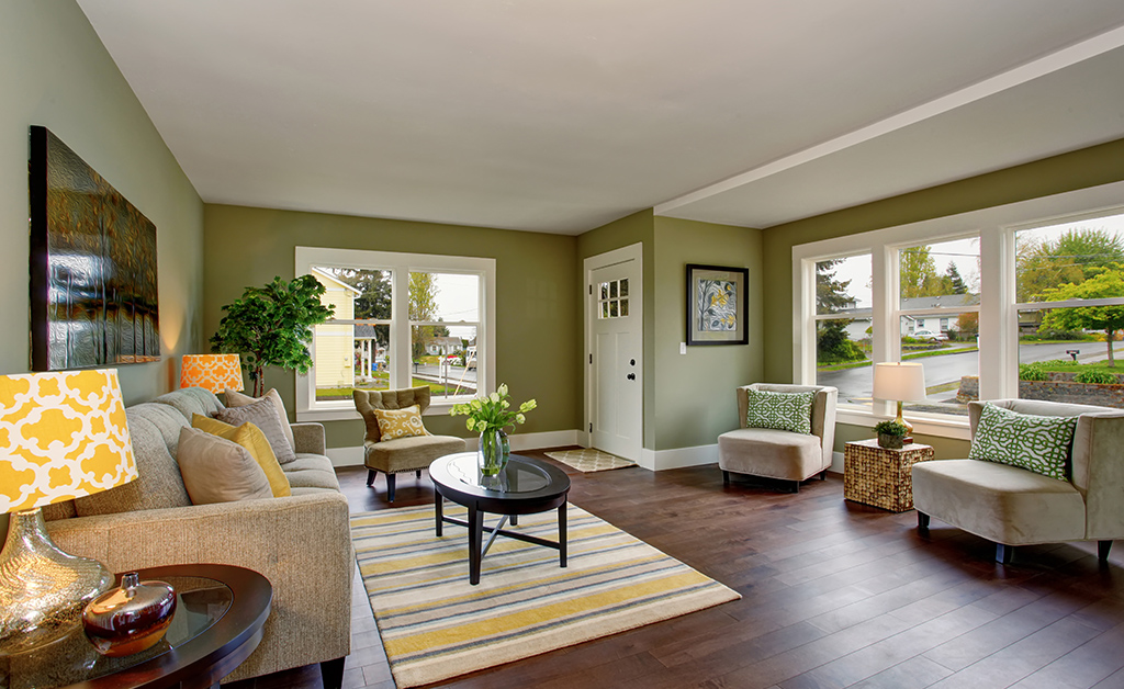
Love
green living.
White walls, woodwork and a slipcovered sofa allow green to take center stage. Strategically introduced via lattice-pattern chairs, a solid tufted ottoman and flowery accent pillows, yellow-tone greens work with orange, brown and gilded accessories to take the chill off the room’s bright-white perimeter.

Take
inspiration from the sea.
The soothing shades of ocean waves shift from green to blue depending on weather conditions and changing light. Similar color variations arise in this green-tinted palette of blues that combines turquoise, aqua, teal, azure and baby blue.

Blend
masterfully.
Sea and sky colors meld beautifully in this space that does double-duty as a nursery and sitting room. The grass-cloth walls weave together navy, cornflower and turquoise to establish the palette of the space. A baby-blue sofa and colorful area rug introduce upbeat rhythms, while the ocean-themed artwork supplies drama. White woodwork, frames and accessories keep the look buoyant and breezy.
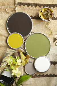
Explore
tropical tones.
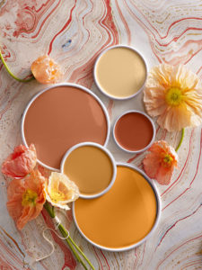
Exotic locales produce distinctive color schemes, including this palette that features coffee-bean brown. Putty gray and creamy white are cool counterpoints to the warm brown—while yellow, citron and leafy green evoke images of sunbeams, tropical blooms and verdant growth.
Apply
a rich brown shade.
Brown walls can enhance the warmth of a room, as seen here in this cozy study. Golden wood finishes, a throw splashed with copper, and a bronze side table blend forest-harvested hues and textures. White woodwork, an upholstered chair and a cowhide rug pop against the room’s dark surfaces; yellowish-green foliage and flowers give the room a refreshing lift.
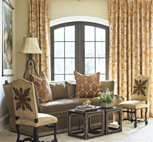
Crush
on orange.
For high-impact designs, try this pumped-up palette of pale, midtone and saturated oranges—including shades of shrimp, papaya, tangerine, coral and blood orange.
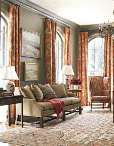
Make
it fancier.
The citrusy scheme takes a formal turn in this elegant living room. Blood-orange drapery and upholstery set a classic tone, while papaya appears in the tasseled blanket and as a pattern on lamp bases. The charming area rug boasts lighter orange shades and complementary deep blues.
Celebrate
environmental influences.
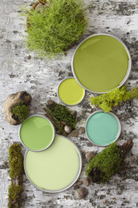
Greens found in forests, orchards and terrariums play well together in designs ranging from contemporary to cottage. This palette (which includes olive, turquoise, aloe, clover and citron) combines warm yellow-greens with cooler greens sporting blue and dusty undertones.

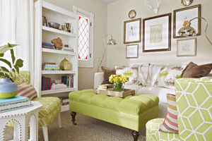
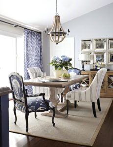
Create
posh digs.
Sun-drenched olive walls supply a chic background for this mix of motifs, fabric patterns and touchable patinas. Bright citron green and turquoise are showcased in the chairs’ flocked fabric—partnering with blue coral wall prints to give this stylish dining room a strikingly coordinated look.

Enjoy
earthen delights.
Shades of terra-cotta, putty, khaki, taupe and amber conjure images of rocky landscapes, prehistoric finds and sandy deserts. Ranging from light to dark, these tones quietly add dimension to rooms meant for relaxing.
Evoke
spice-route vibes.
Saturated amber tones practically glow in this neutrally decorated space. Khaki walls, leather chairs and a lampshade add additional warmth, as does the taupe sofa.
Rely
on rock-solid stone tones.
Although this stony palette’s charcoal and ash grays read as cool, reddish undertones heat up the cocoa brown, cream and khaki to create a perfectly balanced mix of warm and cold hues. Try this color scheme in rooms outfitted with naturally stained cabinets, flooring and furniture.
Refine
neutrals.
Rich brown wood and a woven khaki area rug provide warm counterpoints to this dining room's ash gray walls. Shimmering mirrors contribute yet another shade of gray to the fine-tuned medley.

Indulge
your purple passion.
Composed of red-tinted and blue-shaded purples, this scheme combines a flower’s most vivid and softest hues. Use the pleasing palette of fuchsia, orchid, hibiscus, mauve and magenta to cultivate distinctive designs.
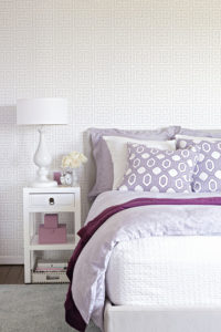
Take
it tonal.
This neutral bedroom showcases dusty and crisp purples in various ways. Deep orchid makes a splash as patterned and solid pillow shams, while a downy comforter sports paler purple. A magenta throw and mauve accessories keep the eye moving throughout the space.
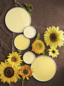
Lighten
up with sunny hues.
Yellow shades of straw, cream, egg yolk, banana and butter emit sun-kissed vibes, making this a popular palette for brightening rooms from kitchens and work spaces to bedrooms and bathrooms.
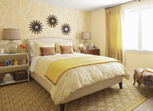
Glow
in gold.
Straw-yellow drapery and walls provide a foundation for more vivacious yellows that amplify this bedroom’s appeal. A banana-yellow comforter and shams step back to let brown-and-orange throw pillows and a marigold blanket shine. The area rug nicely ties all the yellows together.
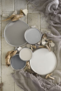
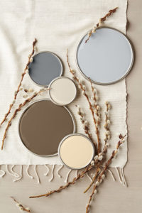
Go greige.
This palette revolves around ever-popular greige, pictured at top. Depending on light as well as accompanying colors, greige can read as gray or beige, making it a versatile hue that works with both stone and wood tones. Here, it partners with pearl gray, khaki, putty and steely gray to fashion a light-and-shadow palette ideally suited to creating peaceful retreats in a range of decorating styles.
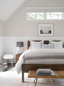
Soothe
with understated shades.
White wainscoting highlights this room’s greige walls and window shades, while steely grays appear in a woven basket, lampshade and blanket. Lighter gray linens soften the bed, and a putty cowhide rug pairs well with the ebony floors and wood furniture’s finish.

Infuse
herbal harmonies.
When tossed together, spearmint, putty, aloe, mint and white generate well-rounded green scenes. Tinted with blue, these refreshing shades read as cool, bright and fashionable.
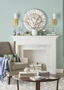
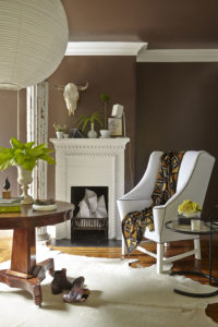
Stun
with simplicity.
Whether light or dark in tone, minty greens are flexible hues that act as neutrals yet demand attention. Here, mint walls handily showcase white elements like the fireplace, and complement the gold and glass in the room. A navy throw, striped pillow and turquoise accessories pick up on the wall’s blue undertones.