
Just because your home is short on square footage doesn't mean you need to skimp on design or style. Don’t despair; there are ways to maximize your minimal space and gain a greater sense of size. Use our expert tips and tricks—from a fellow small-home owner—to help your home look and feel bigger and more open.
Fellow small-home owner Sheila York knows you don’t have to live in a palace-size place to reap the benefits of good design. In fact, smart space-stretching ideas abound in her 1,200-square-foot Michigan home, from room-expanding paint treatments to efficient ways for displaying treasures. Here, she shares her design dos and don’ts for other homeowners who have more style than space.
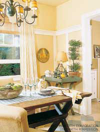 DO: Start at the ceiling. Sheila hung the window treatments in the dining room from the highest possible point on the wall (just under the crown molding). Hanging the curtains high lets the fabric flow freely and tugs the eye upward.
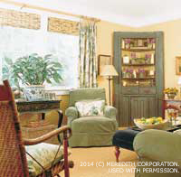
 DO: Include built-ins. They take up almost no floor space but yield plenty of much-needed storage—both perfect characteristics for a small house. Sheila assigned double duties to a built-in bookcase in the living room: it not only holds books and display items but also serves as a mini-bar.
DO: Reflect on the situation. Mirrors and panes of glass act as room expanders when strategically placed to reflect something pretty. The small mirror next to the built-in bookcase in Sheila’s living room doubles the number of pretty glasses in view. And, she made the dining room lustrous by adding glaze to yellow paint so the walls reflect the limited light.
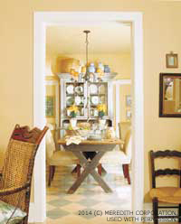 DO: Open rooms to each other. Though it’s important to clearly define separate spaces, some openness between adjoining rooms makes all of them feel bigger. Sheila’s cramped kitchen used to be cut off completely from the dining room, but now a large pass-through connects the two spaces. In a similar way, her office joins the living room through a French door, which allows the two rooms to share the same light and views.
D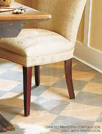 O: Define different spaces subtly. Separate one room from another without choosing completely different wall colors or flooring. A checkerboard pattern in slate blue on the floor of the dining room looks like an area rug without being bulky.
DO: Give each room its own treatment. To differentiate it from the living room, Sheila rag-rolled the walls of the dining room; the living room walls are covered in yellow striated wallpaper. Although the tones are similar (and therefore unifying), the texture in each space is unique.
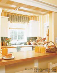 DO: Opt for light colors. One law of color is that pale tones advance, thus expanding a room, while dark colors recede and shrink a space. Sheila’s kitchen gets a lift from airy white cabinets; her bedroom glows with walls covered in white linen.
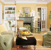
DO: Draw the eye upward. This creates the illusion of more volume, which makes up for a lack of square footage. Crown molding, painted crisp white, defines the ceiling in Sheila’s living room; striped wallpaper also stretches the height of the walls in the kitchen. The dining room walls boast a special treatment: A chair rail, set about two-thirds of the way up the wall, caps pieces of trim that run vertically to the floor.
DO: Keep flooring continuous. Maintaining the same flooring material throughout the house imparts a sense of continuity; the eye does not jump from one room to the next but rather wanders easily between the spaces. Sheila’s hardwood floors are light-stained to look even more expansive.
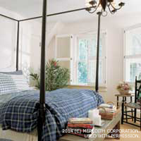
 DO: Invite the sunshine inside. Large windows usher in sunlight to bounce off the walls and brighten even the dreariest room. In an area that requires privacy, such as a bath or bedroom, put up window treatments that can be adjusted easily to let the sun pour in. Light from the windows in Sheila’s master bedroom, for instance, is dappled by hinged shutters. Sheila can leave them closed to stave off the sun’s hot rays, leave one ajar for a little extra boost of light, or open all of them for sheets of sunshine.
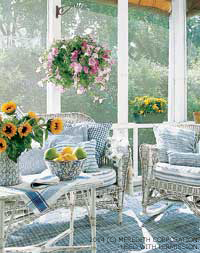 DO: Stretch your space into the outdoors. A patio, deck, or screen porch, such as Sheila’s, goes a long way toward increasing usable space—without the expense of adding on. Sheila’s porch provides all the comforts of an interior room, including screens to keep the bugs at bay, an awning to protect against harsh sun, and cozy, welcoming furnishings that invite lounging. “It’s my favorite room in the house,” she says.
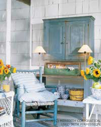 DON’T: Be afraid of large-scale furniture. Sheila recommends using a few dramatic pieces, such as the large, painted, country-style hutches in her living and dining rooms. They add necessary storage and serve as focal points to keep each room from feeling too “wimpy,” she says.
DON’T: Clutter up the house. “Sometimes, less really is more,” Sheila says. “I don’t like my rooms to be crowded, and pieces that work hard are especially important in a small space. When you think you have pared down enough, eliminate more.”
DON’T: Overwhelm with a lot of patterns. “I like my home to be peaceful and serene, so I chose a quiet palette,” Sheila says. “If it weren’t for my cat, who likes to lie on the furniture, I’d have all white upholstery. Sage green is the next best thing.”
DON’T: Forget the ceiling. It’s a room's fifth wall. Gain volume by treating the ceiling the same way as the walls; Sheila continued the rag-rolled yellow paint onto the ceiling of her dining room.
DON’T: Leave out architectural detailing. Not reserved only for ornate areas, accents such as molding and wainscoting are simple ways to define and dress up a small space. In Sheila’s living room, deep crown molding was the inspiration for the color of the just-as-crisp-looking ceiling.
DON’T: Buy furniture just to buy furniture. Figure out how much seating you need for the number of people in your household and the number you typically entertain, and buy enough furniture to suit that amount. Otherwise, you end up with a cramped space that’s not comfortable.
DON’T: Mess with fussy window treatments. Fabric that overwhelms with pattern will draw attention to itself and away from a carefully thought-out room design. Choose simple treatments that filter the sun and provide privacy from the neighbors while blending with your furnishings.
 DON’T: Waste an inch of space. Even the closets should work hard. Sheila recommends installing extra closet shelving for storing shoes and other necessities. She also weeds through her possessions every now and again to keep clutter to a minimum.
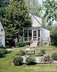
DON’T: Feel limited by a small yard. Sheila’s yard offers seating, plants, and a small pond she built with advice from a local home center.
Adapted from Better Homes and Gardens. Used with permission. ©Meredith Corporation. http://www.meredith.com. All rights reserved.